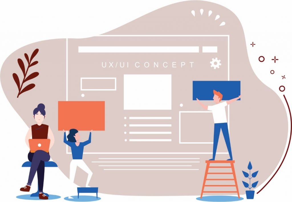
There are many instances when businesses consider UI/UX design as an afterthought. That might have been true in the past, but considering the present scenario, a great design is what can help you make your SaaS product stand out among your competitors. But, what defines a great design? Well, a great design is an equal balance of great looking user interface (UI) and great user experience (UX).
When you create an equal balance of how your product looks(UI) and how your product works (UX), you can deliver a truly exceptional user experience, and urge them to convert into customers. It is important to understand that a great looking SaaS product doesn’t mean it has a great usability. However, that’s where most businesses fail. They merely focus on the look and feel of the site, putting little emphasis on aesthetics and usability.
Create a good UX
If you want to keep your users engaged for a long-term, it is essential to create an exceptional UI/UX. Here’s how you can create a good UX.
#1 Keep only essential elements
Most apps and businesses have adopted a minimalist approach, which have proven to deliver positive results. If you don’t believe something needs to be there, it perhaps don’t.
#2 Personalize content and design
Personalization has been a key factor in helping engage more audiences. When people learn that you know them, you remember them, you understand their shopping preferences, it creates a sense of affection, which is guaranteed to win hearts.
#3 Memorable
Consumers remember every interaction they do with your site, whether good or bad. The more memorable your UX is, the more likely they are to return.
Here is how a well-planned UI and UX can improve your product experience.
#1 Make a Lasting First Impression by Attentively Designing your Homepage
Your homepage is the first impression. By looking at your homepage, the customers decide whether they will stick with you, or they will look for another alternative. Given the fact that the attention span of the users is decreasing, it might be your only chance to make an impression. Put a lot of effort in considering what elements you want on your homepage and in the layout.
Also, remember to keep some breathing space in your design, so that the most significant features, such as site search, brand logo and key services are instantly noticed. Furthermore, when visitors arrive at your site, set a positive tone while communicating with them. Make sure that your customer acquisition strategy is not confusing or overwhelming, and prospects should easily be able to get used to your strategies.
#2 Let them Discover Products Faster with a Powerful Search

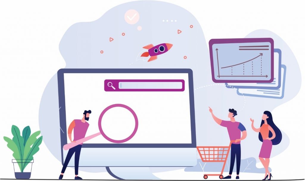
If you want your users to discover your products and content effortlessly without having them to browse through hundreds of pages aimlessly, make sure you provide a well-refined search tool that allows them to find information they are looking for in a matter of seconds. Efficient search and filtering tools make a big difference in SaaS platform UX design.
As a good rule of thumb, place the search bar in the center of the page. Allow your customers to refine the search with appropriate filters, so they can navigate to their desired products much faster. Know that your search is the first interaction point, so ensure you go all out of your way to design the site search that delivers an optimum search experience.
#3 Locate the Most Important Links with User-friendly Navigation
Let’s accept that not every user has a technical background. Therefore, while designing UI/UX design for a SaaS app, one of the important things to consider is making an intuitive navigation and user-friendly interface. The homepage should contain all the important links to your product’s information, so it doesn’t waste your users’ time and they are easily able to navigate to the desired content.
The technical jargon should never be a barrier in making information easy to access. Also, make sure that the navigation is device-friendly. That is because users nowadays don’t access the apps through just the desktop. They browse on-the-go, so think about designing a navigation that adapts to different screen sizes if your user wish to switch browsing from the desktop to a mobile device.
#4 Provide Assistance to your Clients with Robust Support System

SaaS applications are often complex to understand and to work with, and that brings the need of having an efficient support system that resolves client queries. Instead of urging users to refer documentation for help, offer them extra support by designing a help flow that is easily accessible from any part of the app.
Be it a live support system or a chatbox, anything that can assist users in moving ahead will make them stick to your product. You can also design an in-app notification of updates, allowing users to fill their knowledge gap.
Creating an FAQ page of common questions will help users find answers. Several SaaS products also come with inbuilt videos explaining basic functions and tools. Offering a brief introduction about your product as soon as clients visit your site will not only improve user experience, but also provide an understanding of how to use the tool.
Offering a brief introduction about your product as soon as clients visit your site will not only improve user experience, but also provide an understanding of how to use the tool.
#5 Acquire More Leads with Easy Sign-up
Sign-up forms are not the most likeable element on the webpage. They force users to share personal information that they might not be comfortable with, which usually results in high bounce rates. If your goal is to get more sign-ups, ensure the ‘sign-up’ button is placed in the clean and visible location. Clients today have no time to look for sign up buttons, and in case they miss that button, or get mixed up with other buttons, you might just lose them.
Hence, choose a bright color for the button, which is in contrast with the background color. And, since the ‘sign-up’ button is the biggest element in your page, make it a little bigger. Ask for only essential data in the initial stage, and collect other data in the later stage. If you stick to clear and clean sign-up form, it will certainly create a good user experience and help you acquire more leads.
#6 Retarget Clients with a Scheduled Email Outreach

Every user contact information matters. For any SaaS tool, the ultimate goal is to be an integral part of users’ lives. However, getting there is a real challenge. Usually, clients are active in the beginning, but they lose interest over time. Therefore, to keep them engaged, you need to have a strong email marketing campaign in place.
Choose your words carefully while drafting an email. Your email should consist of both offering support and engaging customers. Personalize your subject lines as well, otherwise users may not even open your email. Allow users to reply to your email, and if you are sending no-reply email, mention alternate contact details. Emails give you a direct opportunity to interact with your customers, so use it cleverly.
#7 Provide Feedback to your Users to Boost their Morale
Users liked being acknowledged for the actions they perform, no matter if it is correct or wrong. It is in human nature to be able to know where they are heading, be it in a real life or in the online shopping.
Compliment them after they have successfully completed a task or offer rewards that boost their morale and encourage them to continue using your product. If they have landed in a wrong place or they are wrongly using some features, notify them with a tinge of humor that they are heading in the wrong direction.
#8 Take Feedback from Users to Improve your Product
We all want to deliver the best product, but let’s just accept it that you cannot build it in the first shot. Creating a successful product is an ongoing process that goes through a number of testing, feedback from users and internal communication.
No matter how many tests you conduct, without getting a user opinion, you will never understand what is going and how to improve. If positive feedback is good, then negative feedback is better. It will only motivate you to improve your product. Hence, receiving regular feedback is essential to deliver overall better user experience.
The Bottom Line
For any business, it is important to understand that developing a new SaaS project requires to think about the basic needs, goals and motives of the user in terms of UI/UX. This may be a lot to digest, but it all boils down to how coherent and clutter-free your design is. Your ultimate goal should be to create and effortless and enjoyable experience, so your users continue to love using your site.
If you are looking to integrate such top-notch experience in your SaaS product, Velox Softech is one of the leading UI/UX development companies with years of experience and dozens of successful deliverables. Our team will analyze your requirements and suggest a feasible solution that suits your budget.


